 Open UI
Switch (Explainer)
- Author
- Philipp Gfeller
- Last update
- 2026-02-20
Table of contents
Show / Hide Table of Contents
Overview
A switch toggles a binary state on or off. Other names include “toggle”, “lightswitch”, “toggle switch” or “toggle button”. 1
Dictionary
- Switch
- The component described in this editors draft.
- Active state
- Refers to the “on” position of the switch.
- Inactive state
- Refers to the “off” position of the switch.
Previous proposal
Initially, this explainer proposed the introduction of a new <switch> element. However, after the introduction of the switch attribute proposal at WHATWG, the Open UI community group resolved to support the switch attribute proposal (see resolution of issue #1282). The main reasoning behind this decision is:
- The switch attribute proposal is backwards compatible with browsers that don’t support it by rendering a checkbox
- Safari has already implemented this proposal (WebKit blog post introducing the switch control)
- A majority of the switch examples inspected during the research phase can be implemented with the switch attribute proposal because they don’t require content on the track or thumb
This explainer lists the key differences between both implementations and serves as a reference, but will no longer be actively maintained. The switch attribute proposal is being tracked in the switch attribute explainer and the linked switch attribute pull request.
Design system analysis
During research, 44 Design Systems were analyzed to understand the current state of the art in switch implementations. The results support the decision to support the switch attribute proposal, as the majority of implementations do not require content on the track or thumb and can be implemented with the switch attribute proposal. The key findings are:
- 70% of Design Systems don’t display any content inside their switches
- 30% display content on the track
- 18% display content on the thumb
- 88% use the background color transition animation
- 16% use a track slide animation
Background
The history of light switches date back to the 80’s, and they were used for just the On-Off purpose. The technological advancements of the day allow performing numerous tasks with the help of these light switches, including the adjustment of brightness of lamps.
The first ever light switch worked on a technology called the quick-break mechanism. Invented by John Henry Holmes in 1884, there used to be formation of a residue in the previous arcing technologies, thus reducing the life of the switch.
The word “toggle” is a reference to a kind of mechanism or joint consisting of two arms, which are almost in line with each other, connected with an elbow-like pivot. However, the phrase “toggle switch” is applied to a switch with a short handle. 2 and 3
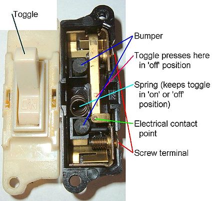 Attribution: Scott Ehardt
Use Cases
A switch can be used to toggle a binary state. Popular use-cases include switching dark mode on or off, switching WiFi or other settings on or off, and extends to any situation where a user is limited to a binary state - true or false, on or off.
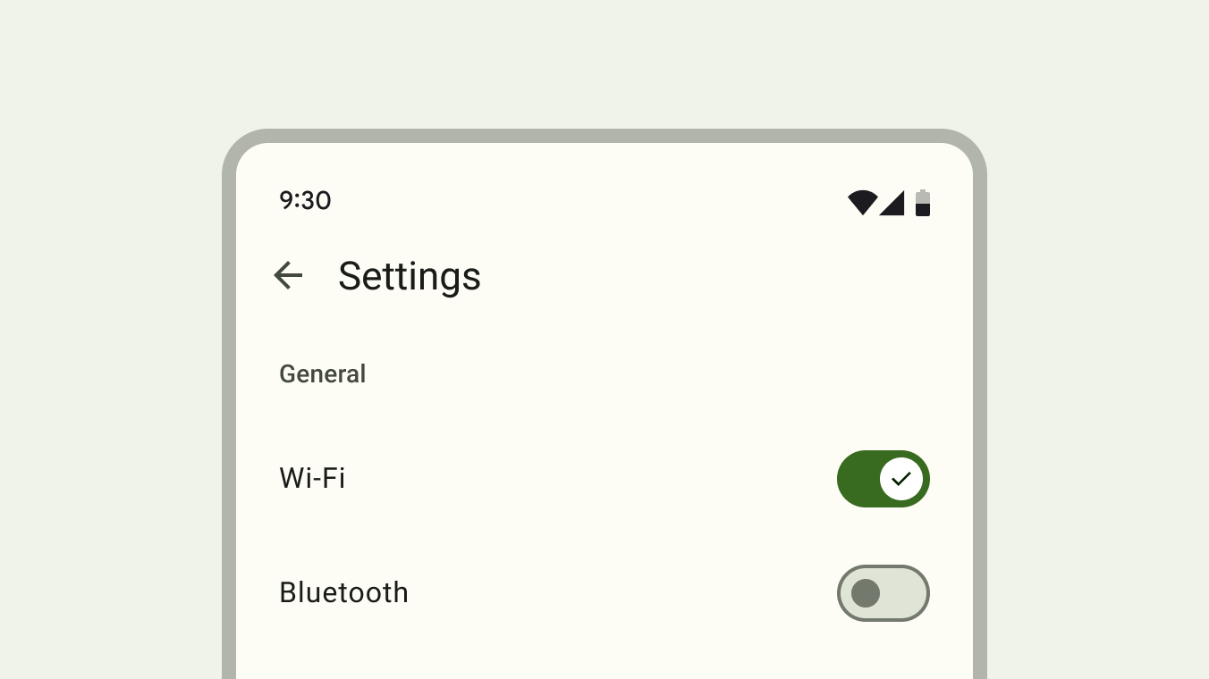 Attribution: Material Design, Google Inc.
Toggling a switch always has an immediate effect.
Pattern differentiation
The switch differs subtly from other related form controls.
A switch differs from a checkbox because:
- It has no indeterminate state
- It requires an immediate action, no confirmation is needed for the state to take effect
A switch differs from a radio button because:
- It always has an initial state, either on or off. A radio button group can be in an initial “nothing selected” state
- Switches cannot be grouped together like radio buttons with the same
nameattribute. Two switches cannot have the samenameattribute. - It requires an immediate action, no confirmation is needed for the state to take effect
A switch differs from a toggle button (with aria-pressed) because:
- A switch has a binary state, while a toggle button is tri-state (on, off, indeterminate) 4
- A toggle button can have an undefined initial state, while a switch always has an initial state of either on or off
Comparison switch attribute vs. switch element
| Description | Switch attribute | Switch element |
|---|---|---|
| Markup | | or |
Styling (re-coloring tracks) | | |
Customizing icon on thumb | Can’t use svg with | Ability to use inline svg with |
Localization of track content | Localization in CSS is not practical | Any localization technique can be used to define slotted text |
With the switch attribute and the ::track pseudo-element, it’s not possible to style the active and inactive track side separately which makes adding text or icons to either side more difficult.
Usage recommendations
Binary states
It’s recommended to use a switch to toggle a binary state. This means a switch should not be used to toggle between two opposite states5. Examples of opposed states include a list vs. map view or switching between light and dark mode. Light mode can be switched on or off, but don’t toggle between light and dark.
Immediate action
Use a switch to trigger an immediate stateful action like toggling WiFi on a mobile phone. Switches should provide an immediate noticeable effect that doesn’t require the user to click “Save” or “Submit” to apply the new state. 5 Switches should never require users to press a button to apply the settings. 6
| Design System | Base element | Recommends immediate action | Recommends form usage* | No recommendation |
|---|---|---|---|---|
| Ant Design (uses button) | button | ✅ | ||
| Material Design 3(uses buttons) | button | ✅ | ||
| Evergreen (uses checkbox) | checkbox | ✅ | ||
| Fast (uses div) | div | ✅ | ||
| Atlaskit (uses checkbox) | checkbox | ✅ | ||
| Carbon (uses button) | button | ✅ | ||
| Fluent UI (uses button) | button | ✅ | ||
| Lion (uses div) | div | ✅ | ||
| Primer (uses button) | button | ✅ | ||
| Bootstrap (uses checkbox) | checkbox | ✅ | ||
| Lightning (uses checkbox) | checkbox | ✅ | ||
| KoliBri (uses checkbox) | checkbox | ✅ | ||
| Semantic UI (uses checkbox) | checkbox | ✅ | ||
| Spectrum (uses checkbox) | checkbox | ✅ | ||
| Tailwind Elements (uses checkbox) | checkbox | ✅ | ||
| WAI-ARIA (examples include button and checkbox variant) | button/checkbox | ✅ |
* No data found for recommendations to use a switch for non-immediate actions.
Features
Animation
Research found two different animation techniques that are frequently used.
Background fade
Upon toggling the switch, its background changes from grey (off) to green (on) and the thumb slides to the respective position. Content on the thumb can indicate the currently active state. Track content is also possible in this variant, but as the track does not move, the content is being hidden and revealed by the sliding thumb.
Atlassian Design System switch animation with content on the track and a thumb that reveals the active content while hiding the inactive content.
Track slide
Upon toggling the switch, the track and the thumb slide together to the respective position. The track reveals the active side of the track while the inactive track side is being hidden. This variant imitates physical switches and can also reveal track content on either side of the thumb, describing the currently active state.
Various Ant Design switch animation with content on the track and a sliding track animation.
Prior Art/Examples
Open UI research page: https://open-ui.org/components/switch/
Styleability
Parts described in the anatomy section should be styleable by providing a pseudo-element.
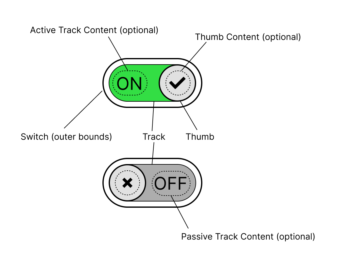
Anatomy
Switch with moving track
Animation variant where the thumb and the track move together to reveal the hidden side of the track. Any text displayed on the switch is optional and defined by the author through a slot or other means.
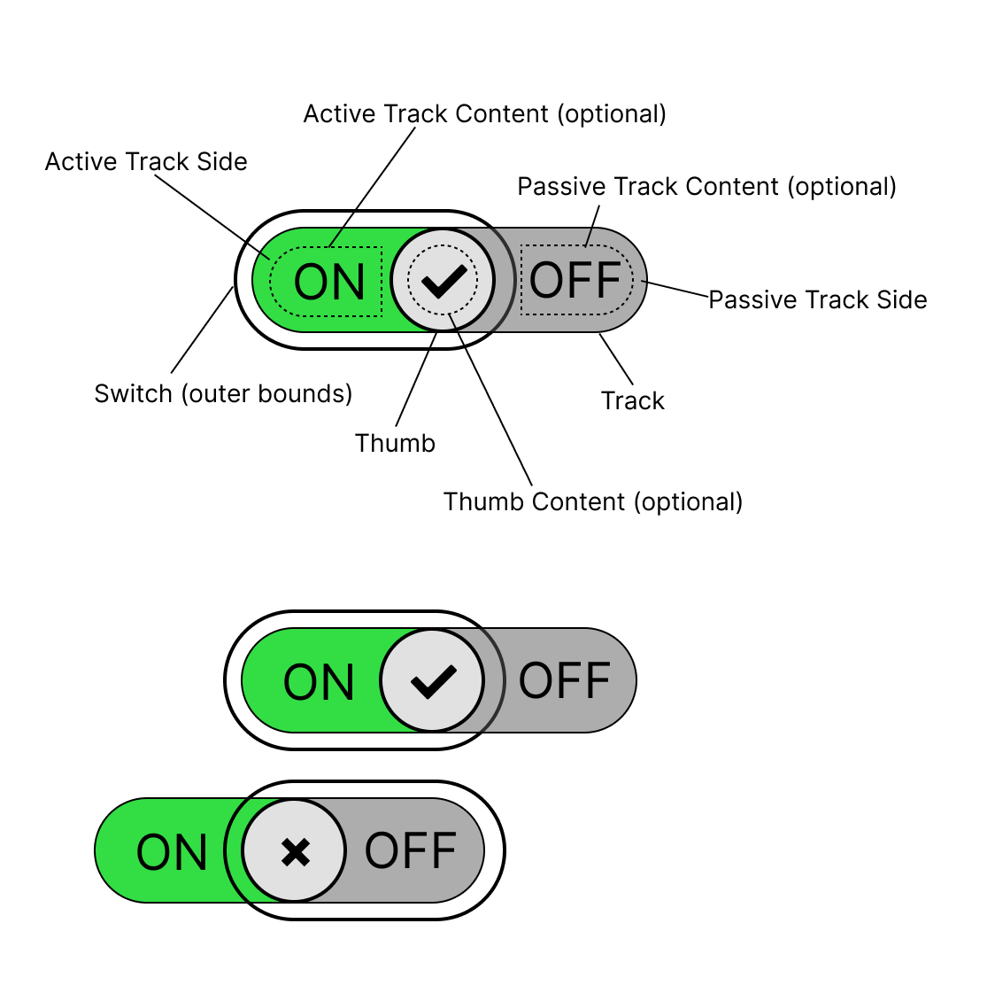 Source: Figma source of switch anatomy with moving track
Edge cases:
This is a list of potential styling challenges.
- The thumb needs to be at least the height of the track in order to hide the boundary between active and inactive track side underneath.
- It’s unclear how to style the track and slider if the track content can be of arbitrary length.
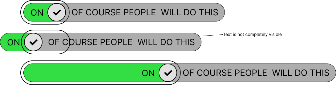
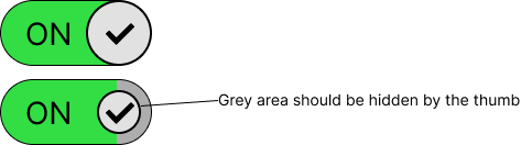
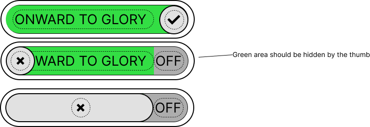
Switch with static track
Animation variant where only the thumb moves and the background of the switch changes color only. Any text displayed on the switch is optional and defined by the author through a slot or other means.
 Source: Figma source of switch anatomy with static track
Edge cases:
This is a list of potential styling challenges.
- The content on both sides cannot be wider than the thumb. Otherwise, the thumb is no longer capable of hiding the inactive track content.
Accessibility
The <input type="checkbox" switch> element can be assigned the default role of switch as described in the Core Accessibility API Mappings. 7
Form Input
The switch is a form associated element.
Use with Assistive Technology
The switch element can be associated with the existing role="switch".
Accessibility resources
Globalization
The switch should adapt to the current text direction8.
| Writing mode | Direction | “on” position |
|---|---|---|
| horizontal-tb | Right to left | left side |
| horizontal-tb | Left to right | right side |
Security
No security implications are expected.
Related issues
- switch: What customizability for animations should be supported?
- [switch]: Naming of the component and its parts
Resources
- Checkbox vs Toggle Switch: 7 Use-Cases of Forms Design: https://uxdworld.com/2018/08/13/checkbox-vs-toggle-switch-7-use-cases-of-forms-design/
- Extreme use cases, useful for scope: https://uxdesign.cc/the-good-the-bad-and-the-toggle-2abc0fbbd099
- Indeterminate state: https://uxplanet.org/ui-switch-component-3f29bc7f4f45
- When to use a toggle switch: https://www.thedesignerstoolbox.com/design-system/when-to-use-toggle-switch-in-ux/
- History Of Toggle + UI/UX Case Study + UI Samples: https://www.behance.net/gallery/70302039/History-Of-Toggle-UIUX-Case-Study-UI-Samples
- Material 3 Switch: https://m3.material.io/components/switch/overview
References:
Footnotes
Component Gallery, https://component.gallery/components/toggle/ ↩
Behance, https://www.behance.net/gallery/70302039/History-Of-Toggle-UIUX-Case-Study-UI-Samples ↩
Wikipedia Light Switch https://en.wikipedia.org/wiki/Light_switch ↩
MDN, Aria-pressed attribute https://developer.mozilla.org/en-US/docs/Web/Accessibility/ARIA/Reference/Attributes/aria-pressed ↩
Material Design 3 Switch, Guidelines https://m3.material.io/components/switch/guidelines#59aa5700-2061-4f12-ad17-3afeb6b1c805 ↩ ↩2
Atlaskit Switch, Usage best practices https://atlassian.design/components/toggle/usage#best-practices ↩
Review by scottaohara https://github.com/openui/open-ui/pull/785#discussion_r1279310394 ↩
Open UI GitHub, Direction change resolution https://github.com/openui/open-ui/issues/1098 ↩